Source from HN because they have shadowbans: https://news.ycombinator.com/item?id=47773594
I’m wondering too what you are looking for in a font. Good looks, features, options to enable or disable, ligatures?
You must log in or register to comment.
I’m not terribly picky, mostly just want to distinguish 0 from O and l from 1.
I rather like JetBrains mono though.
And l from I from | from 1. Stuff like that. And be pretty. And somewhat retro futuristic, without sacrificing readability.
Recently switched to Maple Mono because it is fun and cozy.
Connected strokes in italic style, vivify your code.
That’s cool and interesting (you can see it in action and toggle-compare on the linked website)
I wonder how distracting it would be in code, though. If it is, their configurability allows skipping that feature though, which is great.
Yea, as its only applied to italics its less distracting than it might seem at first. Your IDE may not even use italics. In VSCode with my theme, italics are used for comments and variable names, which looks like this:
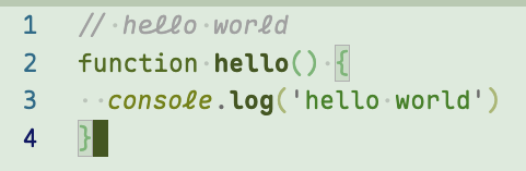
Why is ‘l’ the only cursive letter (and not connected to anything)? It’s kind of jarring
I don’t like that one and the same character looks different on the same line (here
console.log).